Nav list
Nav list renders a vertical list of navigation links.
On this page
On this page
Usage
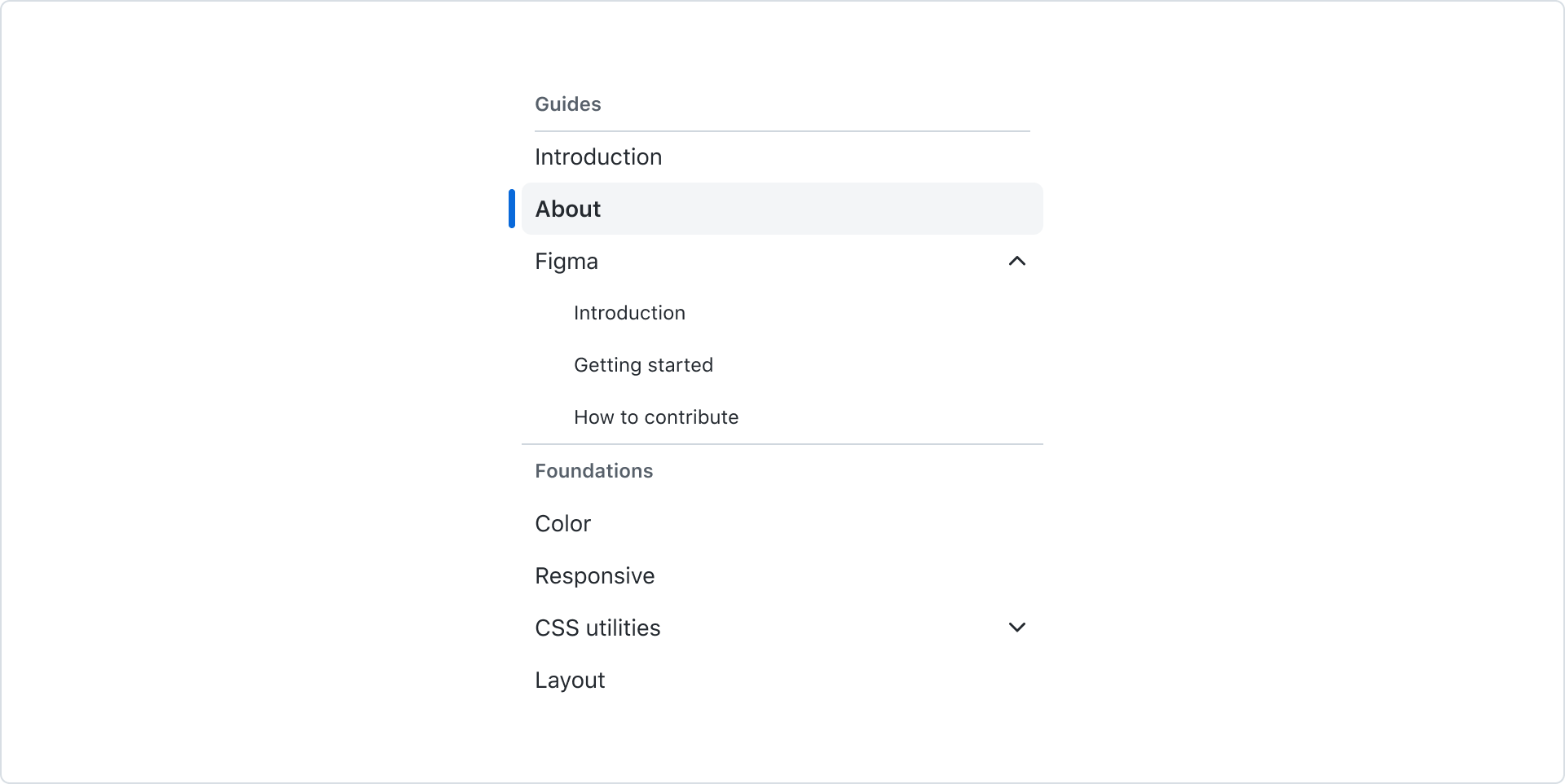
A nav list organizes navigation links for the user's current context and indicates which view they're currently on. It is typically used as a sidebar that changes what is rendered in the main content area.
States
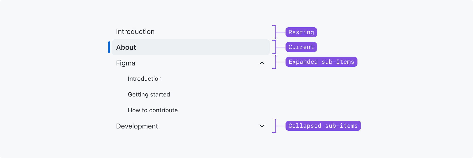
Resting: The default state. The link is not the one currently being shown.
Current: Indicates that this link is the current view being shown.
Expanded sub-items: The item is expanded to show its sub-items.
Collapsed sub-items: The item has sub-items, but they are hidden.
Action list item interactive states: Hover and focus states match the action list items.
Best practices
- Nav list items should only ever be links. Do not try and add items to the nav list that are buttons or non-interactive content.
- If you need to render a list of actions or a list of actions mixed with links, use the action list instead
- Avoid inconsistent use of leading visuals. Ideally all items have a leading visual, or no items have them. This keeps the link text aligned at the start of the item, making the links easier to scan.
- Associate related items using a group or divider when it makes the content easier to understand.
- Items should be listed in a logical or intuitive order.
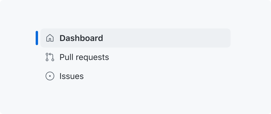
Use leading visuals consistently.
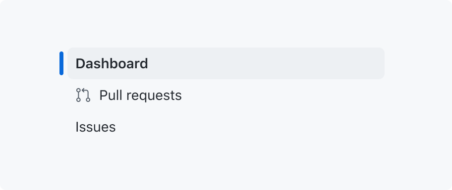
Avoid mixing items that have leading visuals with items that don't.
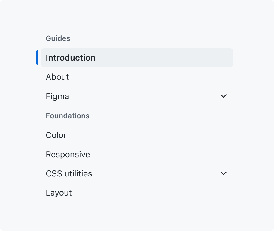
Only use dividers to visually group items.
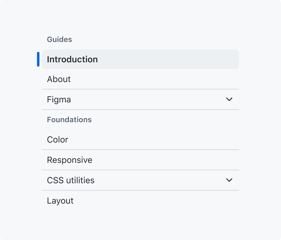
Don't use dividers to separate individual items.
Anatomy
Nav list items are rendered using action list items, so they share anatomy, styles, and some options.
Options
Leading and trailing visuals
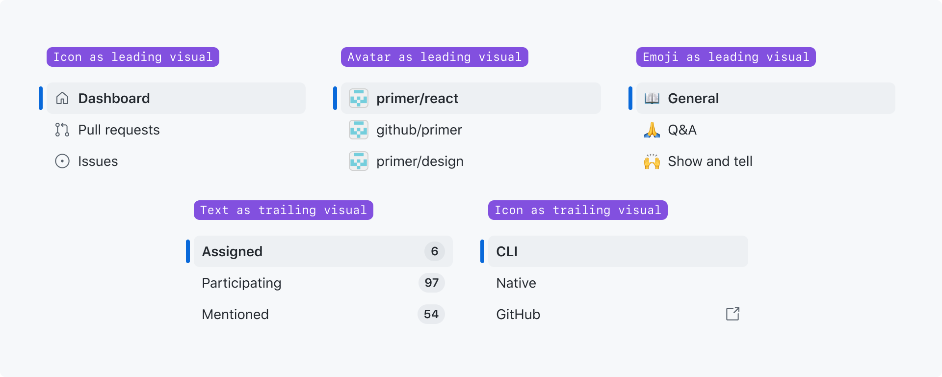
Leading visuals are commonly used to show a visual hint for what the item is. For example, an icon or avatar that represents the view being linked to.
Trailing visuals are commonly used to show auxiliary information about the item. For example, a count of unread notifications on the page.
Nav list items may have both a leading and a trailing visual.
Grouped list sections
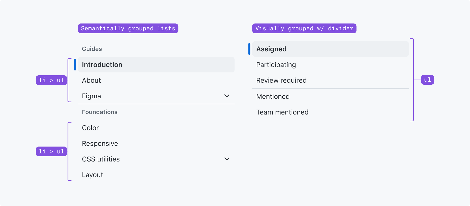
You can semantically group your nav list into multiple lists using groups. You can choose whether or not to show a label for each group.
If you want to visually group your nav list into sections but don't want the semantics of nested <ul>s, you may use dividers to visually break your list into sections.
Grouping should be used to make long or complex nav lists easier to comprehend.
Sub-items

Sub-items may be collapsed or expanded under a top-level nav list item.
The top-level nav list item cannot be a link; it only behaves as a toggle that expands and collapses the sub-items.
Sub-items may be used to render nested navigation structures. Up to 4 levels of nesting are supported. If you need to handle a more deeply-nested navigation structure, reconsider the design of your navigation or the information hierarchy.
Do not replace your NavList with a tree view to support a deeply nested navigation structure. A tree view is never an accessible replacement for navigation, as it serves a different purpose and is not recognized as navigation by assistive technologies.
Accessibility
Nav lists should always be labeled for assistive technologies, even if the label is visually hidden.
Nav list items are links, so they should never contain buttons or other clickable elements.